Showing posts with label Class. Show all posts

Monday, April 8, 2013

Lighting Spec Sheet Project

Fundamentals of Lighting was an eye-opening class that I took in the Fall of 2012. I did not imagine how important lighting and layers of light was until this class. See my post entitled "Light it Up" about the layers of light.

For our final project, we were to design a lighting and switch plan for a young, single male in his thirties who designs custom motorcycles. He rents a city apartment that is a Live/Work space with a lot of exposed construction elements. His current furniture is Mid Century Modern and the lighting fixtures should coordinate with that style.

We received the floorplan and our teacher set us loose.

These were all of the decorative, task, and display lighting fixtures that I used in the design. Also included were the ambient lighting fixtures, which were basically can lights.


I used multiple layers of light in many of the spaces and developed a lighting plan with a lighting legend:

 Each symbol corresponds with a specific lighting fixture listed on this "Spec Sheet".

For details on the the light fixtures, such as photos and other lighting dimensions, I put together a Lighting Fixture Cut Sheet with all of the manufacturer documentation.

All in all, this project definitely taught me how intricate it is to put together a lighting plan, but it also showed me just how many fixtures were needed to have a well-balanced lighting plan in a project. It was very eye-opening.

{Rashida}


Sunday, April 7, 2013

Residential Project: Choosing Textiles

In my Introduction to Textiles class at Chabot, we are learning about the properties of different fabrics and their uses. Our first assignment was to select a series of fabrics for a living and dining room space that we had to draw to scale.

The criteria was as follows:

  • fabrics | a minimum of 3 patterned (more than one color, not tone on tone) fabrics in each room 
  • spaces | dining and living rooms must be open to each other somehow
  • measurements | walls to be 6 inches thick and both spaces need to have a combined area of approximately 600 square feet total
  • scale | 1/2" scale on 11" X 17" paper
  • furniture + decor | living room needs to have six specified items, dining room room needs to have 4
  • presentation | fully color rendered floorplan, 3" x 3" samples of each fabric, and written descriptions of textile fibers

This assignment initially posed as a challenge for me because my design aesthetic is very minimal in terms of colors and patterns. But as a designer, I know that it is important to be nimble and flexible because my clients are not going to be just like me. So, I took this assignment as an opportunity to learn, grow, and expand my skill-set.

I am very intrigued by the Moroccan lattice designs and used that as inspiration as I began to explore patterned textiles.
Different lattice patterns that I used as inspiration for the final design.

Simultaneously, I began to create many floor plan iterations of my adjoining living and dining spaces. The many iterations occurred because plotting on AutoCad at 1/2" scale was posing to be a problem.

My first hand-drafted iteration of the floor plan. It ended up being too large of a footprint and wouldn't fit on the 11x17 paper.
There was not enough clearance for some of the furniture in this iteration.
This pretty much ended up being the final design, with a minor adjustment to the ottoman selection.


Eventually, I found a design that fit and went through a process of pairing fabrics together and pairing fabrics with furniture to see how they complemented each other.

This is what I ended up with:


I am very pleased with the final product (as was my professor). You can find the full presentation, with a detailed look of the fabrics and furniture selections here: Moroccan Twist Textiles Assignment.

I am now excited about working with different patterns in fabric and can't wait until I get to implement textiles in a new design.

Cheers,
{Rashida}

Tuesday, April 2, 2013

It looks like wood, but it's porcelain!


I have fallen in love with a new material that I can't wait to put into our future home. (No, we are not moving, but can't a girl dream? :) )

It's porcelain wood tile!
You would think this is wood, especially with the irregularity of pattern.
This is such a beautiful color too!

It can have all of the beautiful texture and aesthetic qualities of wood, but has the maintenance of regular old tile. And since the tile is porcelain, it is virtually indestructible... unless you took a sledge hammer to it. But just like your toilets, porcelain does not chip or scratch, and can be cleaned with regular everyday cleaning supplies.

Casa Dolce Casa Belgique Collection: It looks very authentic like a wood floor, but it's all porcelain tile.

I was first introduced to it in my Materials & Resources class at Las Positas College. We went on a field trip to All Natural Stone (formerly Callahan Tile). The owners showed us around their showroom, which is absolutely fabulous. If you thought Home Depot had a lot of tiles, you will be blown away by the amount of tiles, stones, and slabs in their showroom.

Anyway, these gems were tucked away in a back room.
Casa Dolce Casa Belgique Collection: Wood Porcelain tile on wall and floor.

Casa Dolce Casa Belgique Collection: Looks great throughout a home.
My guess is that the Casa Dolce Casa's Belgique Collection is pretty pricey. Home Depot also has a few selections of the porcelain wood grain tiles.

So for all the people who have always wanted wood, but:
  • didn't have the budget for it (the wood + stain + installation);
  • have kids and pets that would wreak havoc on a wood floor; or
  • can't muster up the time or funds to maintain a wood floor;
...all hope is not lost. You can have it all.

Dream big my friends,

{Rashida}

Monday, January 7, 2013

Design Board | Parents' Family Room (Formal)

Happy New Year fellow Interior Designers!

Here is another example of a design board that I created for class. It was for the same project as my last design board post. I could not decide which one to present, so I did both.


CLIENT: My parents
SPACE: Current family room
MY DESIGN CHALLENGE: My parents pretty much are empty-nesters. The furniture has been in the living room for at least 15 years and is quite dated, faded, and heavy. The carpet is also a dark green color, which easily attracts lint and makes the the room feel very bottom heavy.

MY CONCEPT: Since my parents are basically empty-nesters and my mother has her own home spa business (BeautiControl by Diane), I wanted to give her a space that used her spa colors but was also elegant. The space would require more labor as it replaces the current fireplace wall, hearth and surround.


After showing my mother both boards, it turns out that she like the Informal Board the best. She thought it was light, fun and more friendly for a family room. She also asked when was I going to get started on implementing it :-/ 

I guess I have to start putting some of my skills to use!

Until next time,

{Rashida}

Saturday, December 22, 2012

Design Board | Parents' Family Room (Informal)

Returning to school to further develop a gift is one of the best things that I could have done! I really had a chance to formally explore how fabrics, materials, colors and textures fit together to make a concept.

A key concept that helped us students have a better grasp on textures, fabrics, colors and materials was a design board.

Design Board (n.) — a physical or virtual board that incorporates drawings, materials, or other swatches to convey your design to your client.

We had many opportunities to create design boards for real or fictitious clients so that we can become accustomed to mixing and matching swatches, presenting our design concept, and using design language.

Here is one of my early boards from class...

Design Board for my parent's family room (informal look)

CLIENT: My parents
SPACE: Current family room
MY DESIGN CHALLENGE: My parents pretty much are empty-nesters. The furniture has been in the living room for at least 15 years and is quite dated, faded, and heavy. The carpet is also a dark green color, which easily attracts lint and makes the the room feel very bottom heavy. I wanted to give them a room with informal furniture, new window treatments, and a lighter color palette.  


I've done a number of these design boards for various "clients", so I'll be posting more boards from my class in the weeks to come!

Stay tuned,

{Rashida}


Tuesday, November 6, 2012

Top Ten Trends in Kitchen Design

On Monday night for my Materials and Resources class (INTD 60), we visited Kitchens of Diablo in Danville, CA. The showroom was beautiful — showing a lot of variety in designs from the modern kitchen with clean lines to the traditional kitchen with grand embellishments and wood detailing. Shelley Lober (the owner) graciously hosted us and provided a lot rich information, showcasing her depth of knowledge in the field. I learned a lot about the trends in Kitchen Design.

So... I bring to you the TOP TEN TRENDS IN KITCHEN DESIGN as told by Rashida.

1. Traditional kitchens are a thing of the past. Go contemporary!
People are now into clean, sleek lines and easy to clean surfaces. All of the extra embellishments and ornate wood carvings are phasing out. This extends to the hardware, cabinetry, and counter-tops. Of course, you have to know your client. Given the location of Kitchens of Diablo, their clientele is not the "trendy" type so they have to cater to their audience.

Too ornate and too much wood detailing. Beautiful but not trendy.
Traditional in every sense of the word.
Contemporary kitchen. Some contemporary kitchens go a little too far into the space age (or the 70's...think Austin Powers). This is a livable contemporary space.

2. Parlez-vous français? Non! French Country kitchens are so passé!
Again, they are too ornate and often times use glazing.

Can you spot the glazing?
I guess the french like this mint color or something

3. Glazed cabinets? Not anymore.
The rustic, worn, distressed look of cabinets are staying where they belong... in an antique shop. Good thing we didn't apply the optional glaze coat on our cabinets in our master bathroom remodel.

These cabinets definitely look old. I thing this look gives too many extra features that aren't needed for a kitchen.
The glazing kind of makes the cabinets look fake.
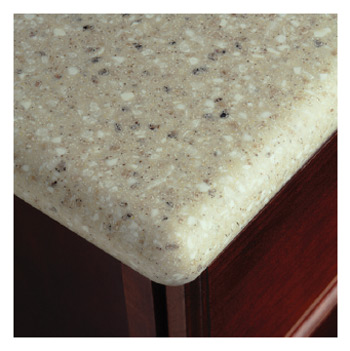
4. Bullnose counter-tops are also old news!
Variations of straight edges are more popular for counter-tops  If you absolutely must have a rounded corner, go with an O'Gee or Pencil nosing.

Bullnose corner! Don't do it!
Other corner types. Try them out!

5. Gray, gray everywhere!
Paint is going gray. Cabinets are being stained and/or painted gray. Flooring is becoming more gray. DuraSupreme (a prominent cabinet provider) has their line of gray cabinets. Do you? (This trend is so prominent right now and I am so glad! I love gray!)

Stunning!
If you can't go with a full gray cabinet, there are other options. Cabinet manufacturers are now coming out with a color called blue corn (left). So instead of the coffees, chocolates, or espressos in cabinets, the trend is to see cabinets that have a tint of gray in the stain.

6. Soft-close drawers are replacing the standard drawers.
Sick of your kids slamming cabinet doors shut? Well this can be prevented with new drawer technology. At a certain point away from the cabinet, the drawers glide shut instead of slamming shut. BluMotion developed this soft-close technology.


7. Lower cabinetry and drawers should not be repetitious like the upper cabinetry.
Lower cabinets should not repeat a consistent pattern around the kitchen. Instead, there should be various sized drawers and/or cabinets.

Don't do this. The lower cabinetry is a series of drawer cabinet, drawer, cabinet, drawer...

These are updated cabinets, but still repetitive.

There are full banks of drawers and full banks of cabinets. Beautiful!
Breaking repetition is not just for aesthetic purposes, but for practicality and functionality as well. Which brings me to #8...


8. Lower cabinets are being replaced with drawers.
Drawers are much more functional than cabinets for the lower levels. Gone are the days of laying on the floor trying to find that one pot cover that is stuffed all the way in the back of your cabinet. Get off the floor with your dignity in tact!

These are alright, but that means it's a two-step process. You have to open the cabinet doors first, then pull out the drawers.

The center island is full of drawers!

9. No more visible frames. Use full-overlay cabinets.
People no longer like to see the support of cabinets. They just want to see the drawers and the doors, creating clean lines.

Huge drawers with no visible frame.

And finally, the best for last...

10. Touch cabinets!
This is by far the coolest thing that I have seen. BluMotion created a cabinet that opens with a light touch anywhere on the cabinet. For all you techies out there, these touch cabinets are a must have! For creatives out there who are trying to get their techie significant other to get involved in the design of their new kitchen, show them this and they'll happily get involved. It is a little pricey right now ($1700 just for two mechanisms), but once the price comes down, I am sure they will be all the rage.

So with all that said, I think I found my dream kitchen in the display room of Kitchens of Diablo.


It has darker brownish-gray wood with full overlay cabinets/drawers. Horizontal clean lines with the hardware.  Soft-close drawers with two BluMotion touch cabinets. An island with cool grayish-blue cabinetry. And a really funky glass counter-top for the island.


Not to mention there are many drawers for pots/pans, baking sheets, garbage cans, and even a counter-top garage for small, portable appliances. But one of the best parts is my new love, porcelain wood tile. It looks like wood, but way easier to maintain (more on this later).


Dream big everyone!

{Rashida}

Thursday, October 25, 2012

The Master Bathroom Project | Refinishing the Cabinets (Part 3)

Weekend #2 in the bathroom remodel! This is part three in my series about our master bathroom remodel. If you haven't read the previous parts on the design process or removing our large vanity mirror, have a look at those first.

I really wanted to change our vanity set in our master bathroom. Get new sink basins, counter-tops, or something... but it is all only 3 years old. And since I am a relatively reasonable person (and the hubby keeps me level-headed when I get a little too unreasonable), we decided to give refacing the cabinets a shot.

Before and after of our cabinet refinish project!
Now, we've actually tried staining wood before with an old kitchen table. Too many steps, very tiring/strenuous (so much sanding!), and we didn't like the finished product... even though we are still eating on said table to this day.


As I mentioned in the design of the master bathroom, when I went on a field trip for my Materials and Resources class, I saw this DIY cabinet refinishing kit. It made the process sound simple and easy, so we decided to give it a whirl. It ended up dramatically changing the look of our cabinets, although I'm sure we could have brushed up on some of the application technique.

Here's how we refinished our cabinets, if you would like to DIY:

SUPPLIES:
  • Cabinet Rustoleum Transformations Kit  (There is also a smaller size just for bathrooms, but we had already purchased the bigger one when we realized it)
  • Two 2" synthetic paint brushes
  • Drop cloth
  • 1-time use laytex/rubber gloves
  • A few paper cups
  • Blue tape
  • A drill or screw driver
  • An extra set of hands
  • Pen/Pencil

DIY STEPS
Time frame: an entire weekend, preferably a 3-day weekend (including drying times)
Follow instructions manual as it is quite detailed. To get a sense of what we did in addition or in substitution of the manual, read through this DIY.
1. Before you leave Home Depot, you have to tint the base color in the kit.
There are two different kinds of kits: a dark color kit and a light color kit. We used the dark one and selected the color Kona. The paint department will tint it to one of the color selections provided on the kit. For our bathroom, we only tinted one of the two base color quart-sized cans since we don't have that many cabinets.
2. Start in the morning.
You have to do at least two coats of the base tint which has 3-hour drying times each, plus a 12-24 hour drying time for the decorative and top coats. It's more convenient to let your top-coat dry overnight, unless you have insomnia and need something to do.
3. Create a quick sketch & number each cabinet door or drawer.
We did a quick layout of the cabinet on paper, numbered each cabinet on the sketch, and numbered the back of each cabinet with some blue tape and a pen. This just helps for remembering what goes where later.

4. Protect your floor and your walls (if you care).
Lay down some drop cloth under the frame of your vanity. You are guaranteed to get stuff everywhere. Also with blue tape, mask the areas of your wall where the frame touches. This will provide a barrier between the deglosser, base coat, top coat, etc and the wall color. If you plan to paint the wall later, as we are, then you can skip this step.

5. Remove each door and drawer frame.
We put all of the hardware for each door/drawer in a paper cup that was numbered according to the sketch in step 3. Simple and organized. You'll thank me later. Our painting zone was in our garage — a place with little to no air movement. You don't want dust particles or other nature-related particles stuck on your cabinets.

Note: If you want to leave the house when the paint is drying, may I suggest parking your cars outside so that starting your engine doesn't blow oil, dust, or dirt onto your cabinets. We failed to do this and had to push our cars out of the garage in neutral.

6. Degloss the cabinet frame and doors/drawers.
This is actually step 1 in the kit; follow their instructions. They provide scrub pads and the deglosser; you need to provide the gloves. When using the deglosser, it was a little hard to tell whether it was working or not because it still looked glossy. But once the deglosser dries, it is easier to see the dullness of the cabinets. Just trust your gut and scrub hard.

Once you've deglossed and wiped down the surface, you'll need to let it dry for 1 hour. This whole process (deglossing + drying) took both of us about 2.5 hours.

7. Apply the base coat color to the frame, and front & sides of drawers.
Again, follow the instructions manual to get the proper technique. I think it's best to use a never-before-used brush to minimize the steak lines. (This is especially relevant for Step 11.) Try to get it as even as possible, but don't worry if you still see some of the old cabinet color. That is why there is a step 8 (you get to do it again!).

Note: Make sure your paint is not dripping or forming puddles on your surfaces. You will see them later when it dries. Let the base coat dry for 2-3 hours. This whole process (painting + drying) took us about 4 hours.

8. Repeat step 7 for frame, front and sides of drawers.
After the first coat has dried, apply a second coat. This step was a lot quicker because less precision was required. If you washed you brush from step 6, make sure it is completely dry, or use a new one. We decided to stick our brushes in a cup filled with the base coat, then used plastic wrap to keep the air out and moisture in so that the brush wouldn't dry out. It worked pretty well; we could just reuse the same brush.

Let dry for 2-3 hours. The whole process took 3 hours.

9. Flip the wood boards over and paint one coat for the back of the drawers and doors.
If you are like us, you aren't that concerned with the back of the doors and drawers. We just did one coat of the tinted color on the back and let them dry. Actually, we didn't even degloss the backs.
10. (Optional Coat) Apply decorative glaze.
This portion is optional and is totally determined by the look you want to create. If you want to see more of the wood grains show through the paint, then you should use the decorative glaze. With the Kona color, it already seemed dark enough where we wouldn't notice much change with the glaze, so we skipped this step.

If you decide to do this, it will take about 8-9 more hours (because of additional drying time).
11. Apply top coat to frame and door/drawer fronts and sides.
It should be nighttime by now (unless you did the decorative glaze at which point it's been nighttime for a while) and its time to put on the glossy top coat. Here is where it is super important to have a soft brush. The brush strokes will show through when applying the glaze. It dries relatively quickly, but also drips a lot. Try to make sure you remove any excess glaze from your boards so that you wont have beads of dried glaze in places. Also, be careful about tiny air bubbles created with the glaze and paint. Not sure how to avoid it, but try to minimize them if possible. Diligence is important here.

Let dry for 12 hours before touching.

12. (Optional) Add handle hardware.
Once the paint was touchable after 12 hours, we added hardware. We wanted a modern feel for our cabinets, so in addition to the dark wood, we also purchased the IKEA BLANKETT cabinet handles. They added a nice touch.

Adding the handles took about 1 hour.


13. Reattach doors and drawers.
If you haven't already solicited help from another person, this is where an extra set of hands is necessary to hold the cabinets in place while you screw them in.

14. Touch-ups and top coat for door/drawer backs.
Once everything was back in place, we saw areas that need some touch-ups of both the base color and the top coat. In addition, we applied the top-coat to the backs of the doors and drawers so that they wouldn't scratch easily.

Phew!!! And that's everything!

Final look of our "brand new" modern bathroom cabinets!

TOTAL COST: $105
I think it goes without saying that DIY is way more cost-effective, but I'll say it again: DIY is way more cost-effective! Because we reused brushes we already had, we were able to essentially get new cabinets for about less than $100 (and a weekend's-worth of time).

We just received an email from Costco about giving our bathroom (or kitchen) a "fresh look" with their new all wood cabinets with All Wood Cabinetry. A quick glance at their pricing, reveals that we would've easily spent thousands of dollars to replace our cabinets. I'd much rather pay with sweat & energy than thousands of dollars!

OVERALL IMPRESSION
Overall, I cannot complain. I think the kit dramatically changed the look of our bathroom, and we haven't even finished our full project yet! The toughest part about the kit was finding the right brush technique. You can still see some of the brush lines, but my guess is that they can be eliminated with a newer, high-quality brush. I want to refinish our kitchen cabinets as well, but the ambient lighting in our kitchen will definitely show the brush stokes more than the lighting in our bathroom. So until I figure out the proper technique, I'll hold off on that.


Next up on the remodel project  is wiring the new lighting! I can't wait for this one! I get to learn something brand new!

{Rashida}

Thursday, October 11, 2012

Kitchen Islands

While we are in the trenches of our master bathroom project, let's talk about something else... kitchen islands!

A beautiful kitchen with a center island

Everyone wants an center island in their kitchen. They seem trendy, provide more counter & cabinet space, and can even provide the space for additional bar height seating. Sounds like a dream!

But before you head down to Home Depot, Lowe's, or Ikea, not all kitchens can support islands. Islands can sometimes make a kitchen even less efficient. Why? Efficient kitchens use the principle of the Work Triangle (I learned about this in my Principles of Interior Design class).


The principle of the Work Triangle refers to the distances between the stove, sink, and refrigerator. The distance between any two of these areas should be no less than 4' and no greater than 9', creating a triangle with a total perimeter between 13' and 26'. An efficient kitchen, has these these three kitchen elements in correct proximity to one another, minimizing the amount of walking between the three.

Now if an island were to break that triangle, as time goes on, you will probably be more annoyed than pleased with your new island installation. Here are some poor kitchen designs that I found on the internet:

The center island blocks a direct path from the refrigerator to the stove
(not to mention the lack of diversity in color)
Looks like a very "Martha Stewart" kind of kitchen, but the island interrupts the Work Triangle.
The stove is too far away from the wood-paneled fridge & the sink on the left.
The Work Triangle in our kitchen is so so. It's a 12.5' perimeter, meaning it is a little too small and that's probably why we are frequently bumping into each other. But hey, it's close, right?

Our kitchen: The side between the sink and the stove is too small..
Perhaps the builder should have moved the sink further from the stove. 

Until next time,

{Rashida}