Sunday, November 17, 2013

The Office: Colors Galore

Hey guys,

After deciding on a layout and determining our aesthetic, it's now time for color! This is the part that I was very excited about for a few reasons.

  1. I'm inspired by designers who use colors, patterns and textures in such tactful ways.
  2. The current color scheme of our house is very neutral — a lot of grays and a bluish gray color... I think it's time for a change.
  3. Using colors pushes me outside of my comfort zone, so I want to challenge myself to use color.
As I was thinking about the office, I knew that every color palette I selected need to to incorporate non-neutral colors. I used Kelly Moore's Color Studio to select a set of colors for three different color palettes. Many paint companies have similar design tools as Kelly Moore. I decided to use Kelly Moore because it's pretty easy to use.

Here's what I put together...

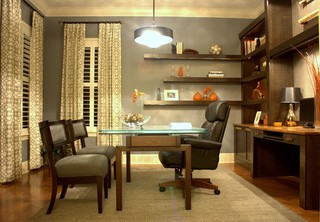
OPTION #1: AUTUMN ACCENT
In this palette, I used neutral color combinations for the walls and tried to bring in brighter pops of color. In general, the palette is very muted, but definitely incorporates colors that I wouldn't normally use.

None of these colors are ones that I would actually, use except for the neutrals (the gray and the charcoal).
But I think they look nice together.

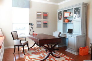
OPTION #2: FOGGY BOTTOM
This palette is very neutral with a small pop of color. Foggy Bottom probably fits better with the themes in the rest of our house.

Pretty much all neutral colors with the purple as the main "pop"

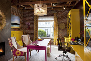
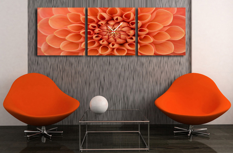
OPTION #3: CITRUS FRUIT
This palette, while full of neutrals, has very bold and strong colors that will make anyone's head turn. It naturally is a more eclectic selection.

Very bright accents...challenge accepted!

In the end, we decided to be bold and step completely out of our comfort zone. We went with Citrus Fruit!

I am super excited to have a bright orange wall and can't wait to piece everything together!

Up next we will take a look at various design concepts in order to hone in on a final concept.


Stay tuned!

{Rashida}

Saturday, October 19, 2013

The Office: What's Your Aesthetic?

Residential interior designers often say that they have to be marriage therapists too. Husbands and wives tend to get at each others' throats when selecting furniture, materials, paint, etc. for something so personal as their own house. Luckily, Ben and I are not the combative type, but I didn't realize how different our aesthetics were until now.

This next phase in our office design, and for any Flashbent Interiors project, is to understand our client's aesthetic. After all, not everyone can live in an boudoir inspired bedroom with black lace...


...but it works for Christina Aguilera.

So how does one figure out their aesthetic?

One great resource is Houzz. It's like Pinterest for interiors. Browse through the many pictures of interiors to get a sense of what resonates with you, what you like, and what you hate. As the designer for our office, I created an IdeaBook with a bunch of images of home offices that I LOVED, liked, and I thought were OK. I didn't select any that I hated since I am also the client :)

I absolutely LOVE this office space. It's unique, bright, modern, and eye-catching.
Contemporary Home Office by San Francisco Interior Designers & Decorators Artistic Designs for Living, Tineke Triggs


I like this. It's a subtle mix of color.


This is not bad. It's a little more traditional or formal than I would like, but I wouldn't protest if this were our office.


Of the 30 home office images that I selected, Ben liked only a few. None were on my LOVE list, but were doable. And marriage is all about compromise. I learned that Ben's aesthetic is slightly contemporary, but highly functional. He wouldn't want anything just because it's "pretty"; it has to be useful.

This was one of his favorites. He really likes the stripes on the wall and likes the clean lines. He doesn't like the main office chair though.


This was probably on the extreme of what Ben liked, but he said he liked the color and that it looks functional.


Given his choices and my choices, we are agreeing that a contemporary style is the way to go. The main colors should be subtle and more neutral looking (for Ben), but there can be some pops of color for my eclectic taste.

I love it when we both can have our way. :)

SIDENOTE // many people think they are a certain aesthetic when they really are not. The nice thing about Houzz is that I can put together an Ideabook with many different styles and tastes to find out what actually suits my clients best.

Next step is selecting our color palette.

Stay tuned!

{Rashida}


Wednesday, July 24, 2013

The Office: Laying out an Oddly Shaped Room

Our Office project is going to be a Furnishing Project. Based on the need-finding we explained in the Setting the Stage post, we only need a furniture solution rather than a structural solution, which would be a Restructure Project. The first part of a Flashbent Furnishing Project is working with the client to choose a layout for the space. Since it's our own project, we are our own clients!

As I mentioned in the previous post, the room we're transforming is very awkwardly shaped. There are lots of doors, the room slants, and there is a built-in window bench. Due to this difficult configuration of space, we decided to mock up a few different layouts in AutoCAD to ensure that real furniture could actually fit in the space. Typically rough sketches would suffice for allowing the client to see the layout opportunities for their space, but precision was key in this case. The layouts had to have:
  • a desk (preferably two)
  • chairs (preferably two)
  • a sleeper couch 
So here we go!

Layout A: This is a basic arrangement, utilizing the right wall for my desk and the couch. The desk is a little too small for the type of school & business work I anticipate doing in the future.


Layout B: This layout features the main desk near the closet, providing a location for a printer, while also being close to the Ethernet port near the main door. The smaller desk in the corner can be used for my computer work, but again is too small for any layout or drafting work.


Layout C: This layout utilizes the right wall for the full desk space, leaving the window seat open as an alternate seating space to the couch. However, it's a tight squeeze between the desk and the wall to the bathroom.


Layout D: In this layout, there are two different sized desks that are arranged more towards the center of the room. It seems a little tight.


Layout E: This last layout places the desks around the edges, leaving access to the window bench. Also like Layout B, having the main desk near the closet is ideal.


Given the need for large desk space for me and the proximity of the main desk to the closet, we decided to go with Layout E.

Up next is the exciting part, determining the style, where we choose the aesthetic for the room.  Do we want Modern? Traditional? Eclectic? Glam? Check back for the next post to find out!

{Rashida}

Monday, July 15, 2013

The Office: Setting the Stage


While our first real project for Flashbent is underway, we also have a little project of our own: converting a bedroom into our home office. We currently have an office, but it's really only a place where my hubby works, plus the space is small and the furniture is too big.

The goal of this project is to:
  • Provide a space in which I can do my school work (so I am not doing it on my favorite place... the kitchen table)
  • Create a space that is ready to meet with potential clients
  • Provide a space for Ben to still do work, as this would be his new office as well
We are treating ourselves like one of our own clients so we can solidify our process, deliverables, and time frame. To use the tech industry's term, we will be "eating our own dog food."

This space is going to have to accomplish a lot:
  • It needs to provide computer space and potentially layout space for me and my projects
  • It needs to be a space for Ben to work with multiple monitors
  • It needs to double as a guest room
  • It will also need to serve as a "man cave" of sorts
Given the room's awkward small shape, we have an added challenge of furnishing the room without completely blocking windows, doors, and pathways.

Small bedroom with barely any wall space and a lot of doors.

In the next post, I'll talk about the different layouts I created to meet our goals and design challenges.

Stay tuned,

{Rashida}

Monday, June 10, 2013

Introducing... Flashbent!

After a year of interior design school and with some hearty instruction under my belt, I present to you Flashbent. We finally started our own company that not only provides interior design services, but also event planning/coordination, personalized web shoppes, and potentially more to come!
Simple logo that is clean and crisp.
Purposefully does not shout "interior design" since the company encompasses many fields.
We are a husband and wife team whose mission is to use the creative gifts God has given us to serve others (1 Peter 4:10). The name Flashbent is precisely that. Flash is to show or showcase. Bent is a natural talent or inclination. So Flashbent is to show our God-given gifts.

Specifically for Interiors, the goals of the company is to provide interior design and decoration services for residences in the Greater San Francisco Bay Area. This can include floorplan design, floorplan remodels,  color consultations, furniture selection/acquisitions, and furniture arrangement.

We also have our first real (as in not family) Interiors client in San Francisco!!! A huge thank you to my colleague (Anna) for recommending me! As the design process unfolds, I will post more about the color and furniture selections.

Stay tuned!

{Rashida}


Monday, April 8, 2013

Lighting Spec Sheet Project

Fundamentals of Lighting was an eye-opening class that I took in the Fall of 2012. I did not imagine how important lighting and layers of light was until this class. See my post entitled "Light it Up" about the layers of light.

For our final project, we were to design a lighting and switch plan for a young, single male in his thirties who designs custom motorcycles. He rents a city apartment that is a Live/Work space with a lot of exposed construction elements. His current furniture is Mid Century Modern and the lighting fixtures should coordinate with that style.

We received the floorplan and our teacher set us loose.

These were all of the decorative, task, and display lighting fixtures that I used in the design. Also included were the ambient lighting fixtures, which were basically can lights.


I used multiple layers of light in many of the spaces and developed a lighting plan with a lighting legend:

 Each symbol corresponds with a specific lighting fixture listed on this "Spec Sheet".

For details on the the light fixtures, such as photos and other lighting dimensions, I put together a Lighting Fixture Cut Sheet with all of the manufacturer documentation.

All in all, this project definitely taught me how intricate it is to put together a lighting plan, but it also showed me just how many fixtures were needed to have a well-balanced lighting plan in a project. It was very eye-opening.

{Rashida}


Sunday, April 7, 2013

Residential Project: Choosing Textiles

In my Introduction to Textiles class at Chabot, we are learning about the properties of different fabrics and their uses. Our first assignment was to select a series of fabrics for a living and dining room space that we had to draw to scale.

The criteria was as follows:

  • fabrics | a minimum of 3 patterned (more than one color, not tone on tone) fabrics in each room 
  • spaces | dining and living rooms must be open to each other somehow
  • measurements | walls to be 6 inches thick and both spaces need to have a combined area of approximately 600 square feet total
  • scale | 1/2" scale on 11" X 17" paper
  • furniture + decor | living room needs to have six specified items, dining room room needs to have 4
  • presentation | fully color rendered floorplan, 3" x 3" samples of each fabric, and written descriptions of textile fibers

This assignment initially posed as a challenge for me because my design aesthetic is very minimal in terms of colors and patterns. But as a designer, I know that it is important to be nimble and flexible because my clients are not going to be just like me. So, I took this assignment as an opportunity to learn, grow, and expand my skill-set.

I am very intrigued by the Moroccan lattice designs and used that as inspiration as I began to explore patterned textiles.
Different lattice patterns that I used as inspiration for the final design.

Simultaneously, I began to create many floor plan iterations of my adjoining living and dining spaces. The many iterations occurred because plotting on AutoCad at 1/2" scale was posing to be a problem.

My first hand-drafted iteration of the floor plan. It ended up being too large of a footprint and wouldn't fit on the 11x17 paper.
There was not enough clearance for some of the furniture in this iteration.
This pretty much ended up being the final design, with a minor adjustment to the ottoman selection.


Eventually, I found a design that fit and went through a process of pairing fabrics together and pairing fabrics with furniture to see how they complemented each other.

This is what I ended up with:


I am very pleased with the final product (as was my professor). You can find the full presentation, with a detailed look of the fabrics and furniture selections here: Moroccan Twist Textiles Assignment.

I am now excited about working with different patterns in fabric and can't wait until I get to implement textiles in a new design.

Cheers,
{Rashida}

Tuesday, April 2, 2013

It looks like wood, but it's porcelain!


I have fallen in love with a new material that I can't wait to put into our future home. (No, we are not moving, but can't a girl dream? :) )

It's porcelain wood tile!
You would think this is wood, especially with the irregularity of pattern.
This is such a beautiful color too!

It can have all of the beautiful texture and aesthetic qualities of wood, but has the maintenance of regular old tile. And since the tile is porcelain, it is virtually indestructible... unless you took a sledge hammer to it. But just like your toilets, porcelain does not chip or scratch, and can be cleaned with regular everyday cleaning supplies.

Casa Dolce Casa Belgique Collection: It looks very authentic like a wood floor, but it's all porcelain tile.

I was first introduced to it in my Materials & Resources class at Las Positas College. We went on a field trip to All Natural Stone (formerly Callahan Tile). The owners showed us around their showroom, which is absolutely fabulous. If you thought Home Depot had a lot of tiles, you will be blown away by the amount of tiles, stones, and slabs in their showroom.

Anyway, these gems were tucked away in a back room.
Casa Dolce Casa Belgique Collection: Wood Porcelain tile on wall and floor.

Casa Dolce Casa Belgique Collection: Looks great throughout a home.
My guess is that the Casa Dolce Casa's Belgique Collection is pretty pricey. Home Depot also has a few selections of the porcelain wood grain tiles.

So for all the people who have always wanted wood, but:
  • didn't have the budget for it (the wood + stain + installation);
  • have kids and pets that would wreak havoc on a wood floor; or
  • can't muster up the time or funds to maintain a wood floor;
...all hope is not lost. You can have it all.

Dream big my friends,

{Rashida}

Tuesday, February 5, 2013

The Master Bathroom Project | Recap + Reveal (Part 8)

At last!

It is with great pleasure that I announce that this is the absolute last post on our Master Bathroom Remodel Project! After 3 weeks of experimenting with new products, learning new skills, and having a messy and unusable bathroom, our master bath remodel is finally complete!

Our Master Bathroom is complete!

Here's the journey of our bathroom transformation:
  1. We first mocked up our bathroom in Google SketchUp so that we could start toying around with potential designs for our new bathroom.
  2. We selected which design we liked the best and the next step was to remove the existing mirror from the wall (without breaking it or creating a massive hole in the wall).
  3. Using Rustoleum's Cabinet Refinishing kit, we refinished our cabinets to a color called Kona. It was quite a tedious process, but I imagine that it was easier than sanding, and it was a huge transformation to the room.
  4. We decided to do the electrical next, while we gave our cabinets time to cure for a bit. Jason from Oak Electric came in and wired new lighting, new electrical outlets, and a new switch.
  5. The second biggest transformation was painting the walls in a black and gray.
  6. Once the paint dried, we moved on to creating two framed mirrors. This was, by far, the most tedious and most experimental part of the entire process, but we got through it...eventually.
  7. Finally, we finished up with some minor finishing touches.

Here are all the "Before, SketchUp Design, and Afters" so you can see the complete transformation in different angles.

Master Bathroom Bird's Eye View

Master Bathroom Entry (Ground)

Master Bathroom Sink & Vanity

Master Bathroom Tub Area

Master Bathroom Entry (Mid-Level)

Our total cost for the project was around $440. (We probably paid somewhere around $350 since we had many of the painting supplies already).

Overall, it was a good experience and we learned a lot along the way — e.g. never build your own mirror frame :).

We have to figure out what our next home renovation project is going to be. When we do, you'll be the first to see the progress! In the meantime, I am going to enjoy my new clean bathroom.

Cheers,

{Rashida}

Tuesday, January 22, 2013

Personalized Wall Canvases

This is a fun project that we did to replace our wedding photo that was above our mantel. It's been a little over two years since we got married and we wanted to update some of the pictures around the house.

Personalized wall canvases are very common and can come in various different forms:


The hubby came up with an idea to take a series of photographs printed on canvas to hang above the mantel.  He was envisioning that I would take 5 photographs making various faces and then he would do the same. Then as our family grows, the collage of pictures would continue with each family member.

This is the originally sketched concept.

As we were brainstorming, we refined the idea. Ten canvases would be a lot of money, so we went down to five. Instead of doing individual pictures, we decided to take photos together showcasing the important parts of our marriage. Pray. Love. Laugh. Live. Play.

 Here's the revised sketch we did to convey the types of pictures that we needed to take.


We waited for a sunny day, took to our Canon Rebel T2i and a tripod, and started shooting some pictures. It was actually kind of exhausting because we had to frame the shot, set the timer, run back to our spots, and pose all within 10 seconds. (We took at least 100 pictures.)

We created our own templates and used Zazzle to create our own personalized wrapped canvases.

Check them out below!

Finished photoshopped images in one long strip


The completed set adds a nice touch to the wall. (And there is space for others canvases to go up as our family grows)

Wanna create your own? Do it on Zazzle!


Much love,

{Rashida}


Friday, January 18, 2013

The Master Bathroom Project | Finishing Touches (Part 7)

I'm back! I know it's been a while... I had final projects, presentations, and tests for school so I was in focus mode. And now that's over and done with, I can finish up blogging about my Master Bathroom Remodel project!

This is the second-to-last installment in my Master Bathroom Remodel project. To remind you all of what has happened so far, check out my previous posts:

This post is just about the finishing touches. We built a small shelf, purchased a wall scone for additional task lighting, and purchased two decorative candle sconces for the back wall. This completes our original design and adds a little bit of interest to the bathroom itself.


PART 1- Building the Shelf

SUPPLIES:
  • One 6" x 4" wood plank
  • Paint (same paint/stain from the Cabinet Refinish Project)
  • Two L-Brackets (you want to buy one that is as long as your shelf protrudes from the wall for support)
  • Wall Screws
  • Edgemate White Melamine Roll
  • Drill
DIY STEPS
Time frame:3 hours

1. Iron on the Melamine around the edge of the shelf.
This provides a smooth edge and eliminates the need to sand the edges. Simply line the edges and use and iron to adhere it to the surface.
Iron on White Melamine Strip
2. Paint.
Paint all surfaces of the shelf. The paint should adhere fairly well to the Melamine and to the wood itself.
Painted Block of Wood
3. Measure and mark where you want your shelf to sit.

4. Drill holes for the screws.
Based on your measurements, mark where the L-brackets will sit against the wall and on the shelf. Pre-drill the holes into the shelf and the wall for the L-brackets.

Note: If you are screwing into a stud, there is no need to pre-drill. When using a wall anchor in place of a stud, pre-drill.

5. Attach L-bracket to shelf according to measurements in step 3.
Make sure to use short screws (1/2") so your screws do not appear on the top surface

Note: We didn't buy appropriately long brackets. We bought these little guys... which obviously did not support the weight of anything on the shelf, let alone the shelf itself. So we had to build our own "L-bracket" out of left over pieces of wood. Save yourself some time and buy one that actually fits your shelf!
Our makeshift shelf support with the small L braces used to attach it to the wall.

6. Attach the bracket/shelf unit to wall.
For this step, use the longer screws that will actually fully penetrate the drywall.

Drilling in an extra screw for support at the end of the shelf.


PART 2- Attaching the Sconce Light
This was part of the reason for the pre-wiring in Part 4 of this blog series. Again, thank you Oak Electric!

SUPPLIES:
  • A wall sconce of your choice
  • Drill
DIY STEPS
Time frame: 10 minutes

Follow the instructions in the box. Each lighting assembly will be different. Be sure to purchase the correct bulb before leaving the store!


The sconce is up and running!


PART 3-  Decorative candle sconces

SUPPLIES:
  • Decorative candle sconces of your choice
  • Drill
DIY STEPS
Time frame: 10 minutes

1. On the wall, mark where you want your sconces to sit.
It may be helpful to have someone hold the sconce to the wall, while you step back to take a look. Mark the spot where the screw would go into the wall.

2. Drill the hole (if necessary) and attach the sconces.


PART 4-  Touch Up
Touch up the paint on any places that seem to need it.
After the sconce light was installed, we realized the mirror frame needed some touch ups.

We never painted our makeshift bracket. So that needed some paint too.

TOTAL COST: $48

OVERALL IMPRESSION
Our bathroom looks more complete with those extra touches. New towels and other little trinkets, such as posters/photos, candles, vases, are great ways to jazz up the bathroom. 

We are finally finished!
The official "clean up" photo.
The last post will have before and after shots to see the scope of the full remodel from beginning to end.

Stay tuned!

{Rashida}